Why do we care?
These metrics are not used in the loss function, they're for us to validate and predict a models true performance. While in many cases, accuracy is enough, it can be misleading.
Example: A model that responds "no cancer" for any human being put in front of it, will be correct in 99% of cases. Its accuracy will therefore look good even though it is useless.
Understanding and selecting the right classification metric is crucial for model selection and finetuning.
Overview of different metrics
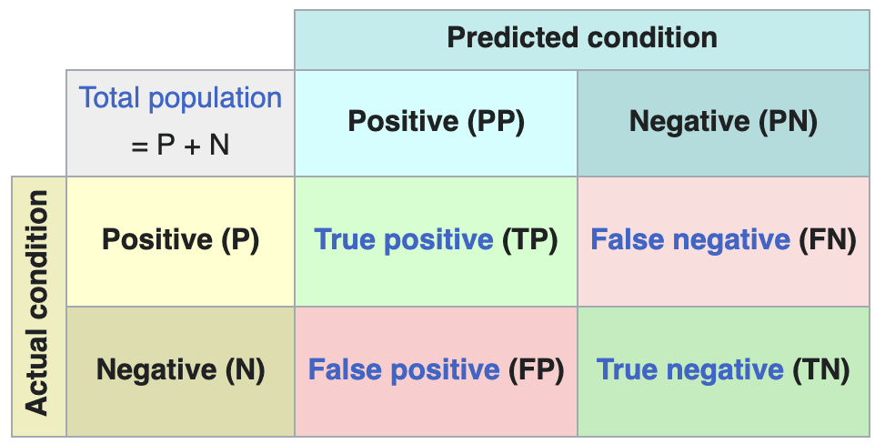
Confusion matrix
The confusion matrix is a representation of Model classification metrics.
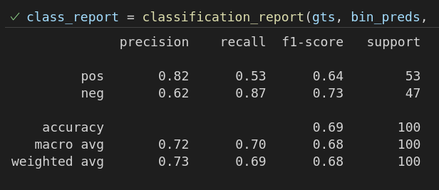
Implementation
from sklearn.metrics import classification_report

y_bin_preds = np.array(y_pred) > 0.5
print("Confusion Matrix:\n", classification_report(y_test, y_bin_preds, target_names=["pos", "neg"])) # target names: 0, 1, 2, ..., str labels in that order
Formulas
| Metric | Formula | Description | Pros / Cons / Use Case |
|---|---|---|---|
| Accuracy | $$\frac{correct_predictions}{all_predictions}$$ | The proportion of total predictions that were correct. See implementation example. | Simple but it is misleading if the dataset is imbalanced! |
| Precision | $$\frac{TP}{TP + FP}$$ | The proportion of positive predictions that were actually correct. | Use when false positives are costly. Example: Spam detection |
| Recall | $$\frac{TP}{TP + FN}$$ | The proportion of actual positives that were correctly identified. | Use when false negatives are costly. Example: medical diagnose |
| F1 Score | $$\frac{2 \times precision \times recall}{precision + recall}$$ | A balance of Precision and Recall, all in one metric. | Considers both FP and FN. If the model fails in either direction, it will give a bad score; ideal for imbalanced datasets. |
| If you are interested in more than the True/False prediction, you want predictions that take the models performance into account. If these are differentiable, then they can be and are used as Loss functions |
F1 Score
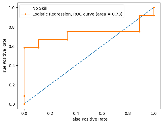
ROC and AUC
There is one issue with the metrics above and the confusion matrix, the threshold. We need to take the value the model returns and decide at which value we consider it a True output, or a False output.
You can of course "find" the best threshold using Hyperparameter Search Optuna, and we do, but to visualize the actual TP/FP rate is also useful.
For that we use a 3 dimensional graph, the ROC curve.
.png)
AUC is simply the area under the curve
An AUC equal to 0.5 is about as good as guessing or, more fancy, the majority class.
Refer to Model classification metrics to understand when to use it and how to interpret it.
from sklearn.metrics import roc_auc_score, roc_curve

# generate a no skill prediction (majority class), optimal outcome = true
# choose 0 or 1 depending on which one is the majority class.
ns_probs = [0 for _ in range(len(y_pred))]

# this example model is a linear regression model.
predictions = example_model.predict_proba(X_test)
# keep only for the positive outcome
predictions = predictions[:, 1]

# calculate scores
ns_auc = roc_auc_score(y_test, ns_probs)
lr_auc = roc_auc_score(y_test, predictions)

# summarize scores
print('No Skill: ROC AUC=%.3f' % (ns_auc))
print('Logistic: ROC AUC=%.3f' % (lr_auc))
# calculate roc curves
ns_fpr, ns_tpr, _ = roc_curve(y_test, ns_probs)
lr_fpr, lr_tpr, _ = roc_curve(y_test, predictions)
# plot the roc curve for the model
plt.plot(ns_fpr, ns_tpr, linestyle='--', label='No Skill')
plt.plot(lr_fpr, lr_tpr, marker='.', label='Logistic Regression, ROC curve (area = %0.2f)' % lr_auc)
# axis labels
plt.xlabel('False Positive Rate')
plt.ylabel('True Positive Rate')
# show the legend
plt.legend()
# show the plot
plt.show()
Flowchart
flowchart TB
A{Threshold known?}
A -->|No| ROC
A -->|Yes| B{Dataset balanced?}
B -->|No| C[F1 score]
B -->|Yes| Accuracy