Library: matplotlib Link
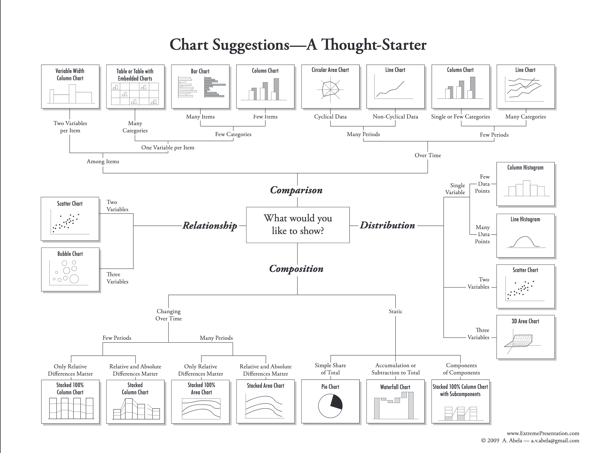
Which graph for which type of data
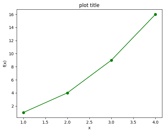
Basic example:
plot some connected points
import matplotlib.pyplot as plt
import numpy as np

x = np.array([1,2,3,4])
y = x**2

plt.plot(x, y, marker='o', linestyle='-', color='g')

plt.title("plot title")
plt.xlabel("x")
plt.ylabel('f(x)')

plt.show()
Plot a function
Exactly as before, just with a really high number of points. {python} np.linspace(start, stop, number). Don't overthink it.
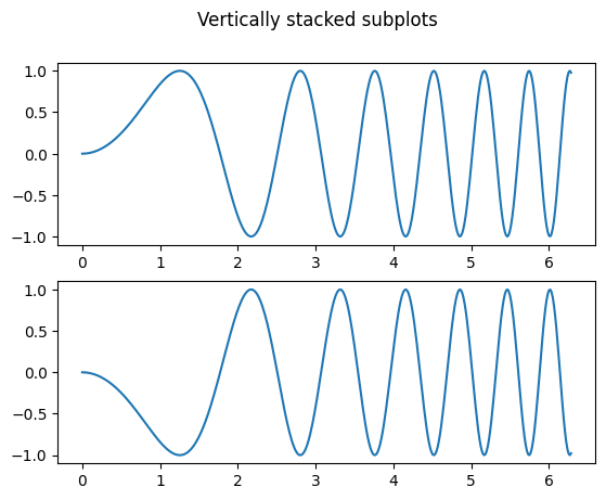
Subplots
import matplotlib.pyplot as plt
import numpy as np

x_0 = np.linspace(0, 2 * np.pi, 400)
y_0 = np.sin(x ** 2)

x_1 = np.linspace(0, 2 * np.pi, 400)
y_1 = - np.sin(x ** 2)

fig, axs = plt.subplots(2, 1) # 2 rows, 1 column
							  # there is only one fig, but multiple axes.
							  # axs has shape (2,)
fig.suptitle('Vertically stacked subplots')

axs[0].plot(x_0, y_0)
axs[1].plot(x_1, y_1)
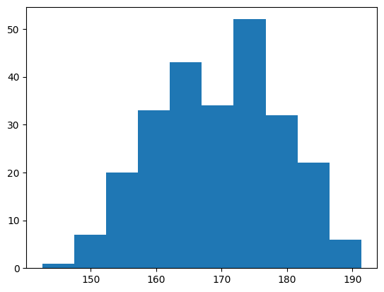
Histograms
Histograms are used to visualise numerical data distributions. If you want to visualize discrete data distributions, see Bar Graphs
import matplotlib.pyplot as plt
import numpy as np

x = np.random.normal(170, 10, 250)
# the bins are the amount of "categories" in the x axis

plt.hist(x, bins=10)
plt.xlabel("bin means")
plt.ylabel("amount of elements in bin")
plt.show()
Box Plots
Used to visualise the distributions of numerical data. Has the advantage that it is an extremely fast overview.
a = np.random.uniform(low=0, high=50, size=1000)
b = np.random.uniform(low=10, high=200, size=1000)
c = np.random.uniform(low=20, high=30, size=1000)

d = {"firstCol": a, "secondCol": b, "thirdCol": c}
df = pd.DataFrame(data=d)

boxplot = df.boxplot()
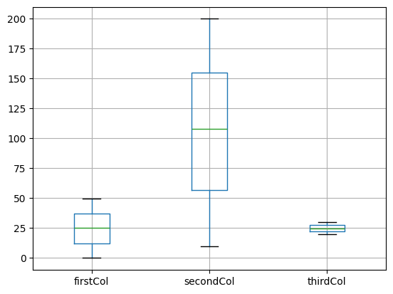
These comparisons only make sense, if the data is actually comparable. The Y column needs to mean the same for every column.
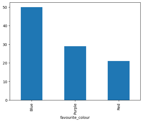
Bar graphs
Used to visualise discrete data distribution.
import pandas as pd
import random

# Let's create our own pandas dataframe:
colourList = []
for _ in range(100):
	r = random.randint(0,100)
	if r <= 50:
		colourList.append("Blue")
		continue

	if r <=80:
		colourList.append("Purple")
		continue

	# if value above 80
	colourList.append("Red")

d = {"favourite_colour": colourList}
df = pd.DataFrame(data=d)

# counts in a pandas dataframe itself that can be plotted.
counts = df.value_counts()
counts.plot(kind='bar')
plt.show()
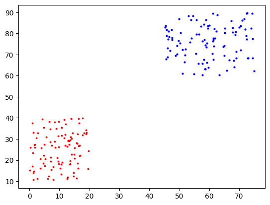
Scatter Plots
Used to find clusters or patterns in the data that are visible if you look at the entirety of the dataset
first_c_x = np.random.uniform(low=0, high=20, size=100)
first_c_y = np.random.uniform(low=10, high=40, size=100)

second_c_x = np.random.uniform(low=45, high=75, size=100)
second_c_y = np.random.uniform(low=60, high=90, size=100)

plt.scatter(first_c_x, first_c_y, s=3, c="r")
plt.scatter(second_c_x, second_c_y, s=4, c="blue")
plt.show()
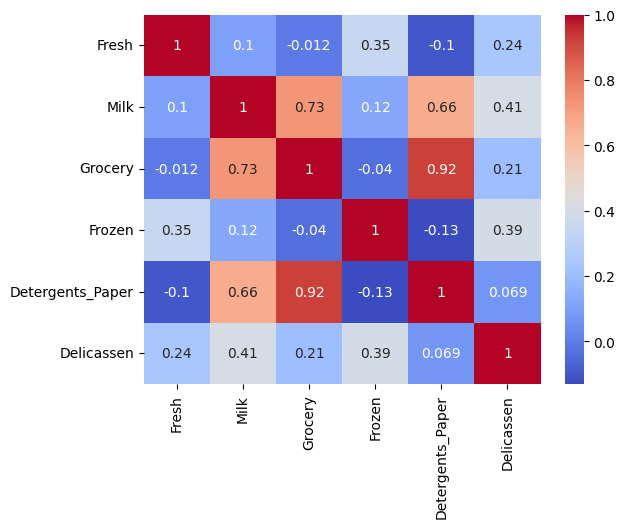
Heatmaps
For Heatmaps we use the seaborn library. It is a library built on top of matplotlib. They are particularly useful to quickly visualise data and notice correlations.
import pandas as pd
import seaborn as sns
import matplotlib.pyplot as plt

# X being my Dataframe
correlation_matrix = X.corr()

sns.heatmap(correlation_matrix, annot=True, cmap='coolwarm')

plt.show()
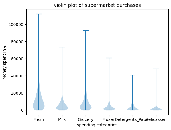
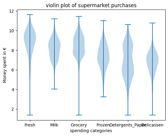
Violin Plot
If the data is in categories, and is comparable between categories (same unit for example), to compare them you need to do as many plots as there are categories. It is an advanced form of the Box plots but might show more variation in the data
import pandas as pd

df = pd.Dataframe(...)

plt.violinplot(df)
plt.xticks(ticks=range(1, len(df.columns) + 1), labels=df.columns)

plt.title("violin plot of supermarket purchases")
plt.xlabel("spending categories")
plt.ylabel("Money spent in €")

plt.show()
import math

theta = 1 # example value

for column in X:
	X[column] = X[column].apply(lambda x: math.log(float(x) + theta))
Grid layout
Example with fig.add_subplot
def create_image_grid(images, show_axis=True):
    amt_images = len(images)
    if amt_images > 9:
        raise ValueError("Can only visualize up to 9 images at once.")

    # we want a max of 3 columns.
    # it is important that both of these variables are integers!
    amt_cols = min(3, amt_images)
    amt_rows = int(np.ceil(amt_images / amt_cols))

    fig = plt.figure()

    for i, image in enumerate(images):
        # Iterating over the grid returns the Axes.
        ax = fig.add_subplot(amt_rows, amt_cols, i + 1)
        ax.imshow(image)

        if not show_axis:
            ax.axis('off')

    # adjust spacing between subplots.
    plt.tight_layout()

    plt.show()

example with plt.subplots:
def create_image_grid(images, global_title=None):
    if amt_images > 9:
        raise ValueError("Can only visualize up to 9 images at once.")

    amt_images = len(images)

    amt_cols = min(3, amt_images)
    amt_rows = int(np.ceil(amt_images / amt_cols))

    fig, axs = plt.subplots(amt_rows, amt_cols)

    if global_title:
        fig.suptitle(global_title)

    for i, img in enumerate(images):
        row, col = divmod(i, amt_cols)
        axs[row][col].imshow(img)

    # Globally turn off all axes
    for ax in axs.flat:
        ax.axis("off")

    plt.show()
Small things you can do in plots
horizontal line:
plt.axhline(y = VALUE_HERE, color = 'r', label = 'mean outlier score')
vertical line:
plt.axvline(x = VALUE_HERE, color = 'r', label = 'mean outlier score')
set axis limit:
ax = plt.gca() # get current axis
ax.set_xlim([xmin, xmax])
ax.set_ylim([ymin, ymax])
add a legend
{python} plt.legend()